Sunday 23 December 2012

No.1 – Let’s get this party started!


It has indeed been a wonderful year for design. We have seen the big, the small, the inventive and the mind-blowing. But 2012 truly made the UK design community proud to be British. So it is, perhaps, no surprise, that for the top spot we salute the best of British and award Danny Boyles opening ceremony at the 2012 Olympic games First place!
  One of this nations most creative minds had the entire country looking to him to show the World that we are still a nation of true strength and innovative brilliance.
And didn’t he deliver! 
 The Isles of Wonder; Meadows, industry, the NHS, women’s vote, a 23-ton bell, a 3-ton oak tree, Tim Berners-Lee, 10,500 athletes, future athletes, 15,000 volunteers, Lord Voldemort, Mr Bean, speed boats, David Beckham in speed boats, fireworks, light shows, moving rings and of course, Bond. Bond and the Queen that is…jumping out of a helicopter!
 A truly great show and incredible way to start the 27th Olympic games. A 3hr 45min show that 900 million people tuned in to watch live across the world.
There is too much to mention in one blog, so in the spirit of a top 10, here’s a top 3 of why we thought the opening ceremony is the most exciting thing that inspired us this year:
No.3: Those little screens by every seat in the stadium that turned the whole place in to a huge TV screen.
  Each screen acted as giant pixels, that on mass, when in close proximity and when viewed from a distance made one huge circular screen with the most amazing content! 
 It transformed the stadium. It made the viewing gallery become part of the show. Every interaction was relevant to what was happening down below and either complimented the story or distracted the eye whilst the set was being changed. The vision to create something like this was outstanding and a great example of integrated technology.

 
No.2: Thomas Heatherwick’s Cauldron. 
 The best kept secret of the games and an underlying story in its own right. People from each of the 204 participating countries were walking around with these beautiful copper objects. One by one, each would be offered up in the centre of the stage in a circular pattern on the floor. Once lit, they then began to slowly rise and come together to create a huge burning cauldron that would remain as focal point for the games. At the end of the games the cauldron was dismantled and each country took home its petal to help inspire the future generation of Olympians. 
 The unity that it represented and the way that it did it has never been seen before. Yes there have been many different shaped cauldrons in the past, but nothing like this. This reminds us that no matter what the challenge, we can always do things differently. 

No.1: The story telling itself through the transformation of space.
Everything needs a story. But once you have one, telling it isn’t always easy. But on a mass scale, Danny Boyle did it through what he called the “biggest scene change in theatre history”. And he wasn’t wrong. Those sets. What a masterpiece! 
 One minute a peaceful green meadow with animals and all, then a 3-ton oak tree lifts in to the air leaving a hole that 2,500 workers emerge from. At the same time, from within the fields a huge industrial monster is woken from its sleep and rises to the sky with 7 smoke stacks breathing life to a new era. During this new era it appeared that workers were forging a huge ring out of molten iron that then rose in to the air to be joined by 4 other rings. When joined they ignited and rained down on the workers below!

 Truly inspirational.
The story continued with tales of tributes to the NHS, a giant house of music, even the dropping of 7bn pieces of paper in to the stadium that represented each person on the planet. It all seamlessly told a bigger story that kept us all watching for hours!
 This change in pace and sheer scale and realisation just blew us away! It shows us that the physical can be so much more than just 4 walls. Combine the right team of people and anything can be achieved no matter how adventurous.
This moment in 2012 made us all feel terribly proud to be British. But none more than the creative industry. It showed the world that we can create masterpieces that will be remembered forever, no matter how hard times are…dare I say, were.
We have a good feeling about 2013. A shift has certainly taken place over the past 6 months in our studio that shows positive signs. The percentage of retail vs F&B is significantly up. We’ve opened 6 stores within 8 weeks in the run up to Christmas. There are more entrepreneurial starting-ups knocking on the door. And the big boys have started to invest in design once more.
So that’s that! The Top 10 things that got us most excited in 2012.
We wish you all the best for 2013 and challenge you and your projects to go bigger and better than ever before. You never know, you might even make the Top10 next year!
Merry Christmas.
TYC

Tuesday 18 December 2012

No.2 - Small but beautifully simple

Second place goes to one of the best creative ideas I have quite possibly ever since. The Coke Friendship machine was a piece of true design genius.

When challenged to create something to celebrate friendship day (30th July: actually created by the Greeting cards industry btw...!) the creators designed a new vending machine that looked exactly like the old one. Only it was twice the height and vended 2 bottles for the price of one. Which is nice.

The thing is, its friendship day, so you'll need a friend to help you...because the coin slot and buttons are 2.5m off the ground!

Watch this video to see how the designers created something so simple but so engaging they raised sales in each vending spot by 1075%!!!!!!!!!!!!


For me, this was design in the truest sense. They took a challenge. Explored the essence of the celebration. Thought about the interaction. And then rewarded that interaction.

The interaction was the design, not the product. It's when designers think in this way, we get those results that make us go wow! Just look at how many of those people were smiling and laughing whilst using it. Thats good design.

That's why, although small, the Coke Friendship Machine gets our No.2 vote!

Because, remember, Christmas is coming :)

Thursday 13 December 2012

No.3 - Goes to a greenhouse...a rather large one!

So the Eden Project was cool. Now though, in comparison to The Cooled Conservatories at Gardens by the Bay in Singapore, it looks like your granddads shed! This incredible building not only gets our No.3 spot but even won the WAF Worlds best building!

Designed by Wilkinson Eyre, The Cooled Conservatories demonstrates the governments commitment to turn Singapore in to a 'City in a garden'. This entire structure is built on reclaimed land and houses the main attraction, two huge conservatories. The first houses a Mediterranean garden that demonstrates to visitors how plants and environments can change throughout seasons (of course living in an eternally tropical climate, locals may have never seen seasonal change).

With everyday selections from the Cultivated Worlds to the extremes of the Strange Worlds its a feast of vegetarian wonder.

In the second you'll find the Cloud forest complete with a 35m high waterfall, sky walks and a mountain!

The plantation is cool for sure, but the sense of scale of this project, and the overwhelming effect it has on you, is profound. The architecture is awe inspiring. We prefer the cell-like structure of the Eden project but the sheer size of this space would make a similar structure surely impossible.

Move away from the conservatories and walk through the 18 super-trees and yeah, they look cool! But wait.......what's that, they're engines....?!?!?!?! Oh yes, that's right, solar engines that power the conservatories! So they look like they are from Avatar, when in actual fact, they exist in todays world and they have a function as well as look beautiful. I'm starting to get giddy!

We've given this the number 3 spot because, yes, we know it cost £250m and yes it huge, but the vision that it represents from a forward thinking government trying to integrate sustainable, environmentally friendly design in to the very foundations of its city, is truly amazing.

So congratulations to The Cooled Conservatories, not only the worlds best building but also No.3 in the TYC Top 10 most exciting things of 2012....! :)

Go visit people!


Tuesday 11 December 2012

No.4 - Fortune rewards the brave!

From my first ever visit to Holland back in '98, I have loved the Dutch approach to design. So much so I try to visit every year and they never fail to surprise me. This year, once again they have wowed me once more before I'd even left the airport.

At Schipol airport we were blown away by 3 new additions to Lounge 3. Say Cheese, House of Tulips and Bread don't leave much to the imagination in terms of what they might sell! But this is just part of their beauty. If you make it obvious what you are selling, customers will get it. So what designers, Tjep's have created here, is just pure brilliance!


Bread is selling the most amazing sandwiches, loafs and time-of-day snacks. With an 8m high wall of giant bread loafs piled high, you see it from miles away. The biggest bakers shelves ever perhaps? The craft here (and on all of these concepts) is beautiful. The giant loafs are actually craved from ash wood and look unbelievably convincing. The product display is simple with layers of interest and pin pointed lighting. The graphic comms is wonderfully illustrated too.


Next, Say Cheese. Not only in the shape of a big cheese, but actually made to look like its constructed out of piled high cheese wheels! Oh, and there's the huge cheese wedge as a back drop too in case that was too subtle! The product quite literally becomes the hero here and equally makes as much impact as Bread.

But the 'piece de resistance' is the House of Tulips. Its architectural form is striking (based on the architecture of the Dutch green houses). Its green glass eye-catching. Its product display rustic by comparison. But the real theatre comes when the store opens and closes. Just watch this video and look out for the sales assistant standing outside the unit on the right hand side in the black and pink top.


How amazing is that?! The whole shop lifts up! What a wonderful way to manage security and set out a stall. The sheer drama around opening and closing, combined with the sense of scale is incredible.

What all these kiosk have done is create a memorable, theatrical space that you can't help but be attracted too and smile at. This can be hugely underestimated in retail, the power of a smile. If we smile, we're usually happy. If we're happy, we spend money!

Thinking of doing a kiosk sometime soon? Could you be this bold? You'd do well to. The sales have doubled since these new designs were installed!

Hats off to the brave!


Thursday 6 December 2012

Number 5 - We get all magical!

We realise this is somewhat unexpected. And slightly on the kiddy side of entertainment. But.......WOW!!!!!!!!

How often do you get to go on the sets of one of the biggest film franchises of the modern day, see behind the scenes and the craft that goes into creating such a master piece?! Exactly. That's why Harry Potter World is a well deserved and magical No.5.


Located just out of London in Leavesden, the setting is where most of the filming actually took place. Based in a huge warehouse very little is given away from the outside but once you enter the doors, the magical world of HP comes to life.


The tour itself takes you through the Great hall, The Ministry of Magic and Dumbledores office to name a few. The attention to detail is incredible but also, and surprisingly, the methods of construction. For instance the green tiles of the MOM that have that beautiful bevelled green tile with the depth of colour is actually MDF sprayed to look like tiles!


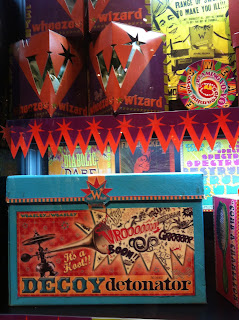
Many of the secrets are given away on the tour and hundreds of props are on display showing the workings and development of each. As you enter the world of Honeydukes sweet shop it's a graphic designers dream! Each and every piece of packaging has been designed and made in true wizzardry styling, slightly reminscent of the post war era of the 1940's - full of colour, excitement and expressive forms. It's enough to stop any child in the their tracks (any design interested adult too!).


As you progress through the tour you enter the drafting workshop. And I thought drafting was a lost art. Oh no, in full swing, in the world of set design it seems! OMG, the drawings of the sets and characters are mind-blowing! So much care and attention has been taken with each drawing they look like masterpieces (so amazing, one of them now hangs on the wall in the office!).


And for the finale of the tour, and quite possibly the biggest surprise of the film, Hogwarts.............the model! Yes, that's right, the entire castle is a huge model that is green screened and then super imposed using visual effects.


After the tour there is the expected retail offer where visitors can buy everything from wands to broomsticks, mugs to uniforms and everything you could possibly imagine. The shop is nicely designed too with surprise and wonder around each corner. Its fair to say that practically every child left with a bag so well done HPW!

As excitement goes, and regardless of whether you're a fan or not, this is an amazing day out and a mind blowing experience.

So in the words of the esteemed Dumbledore, "join us here and your education in the magical arts will begin....with the TYC blog......!".

(Sorry, couldn't resist :)

Tuesday 4 December 2012

Number 6 – Finger touch payment at the party capital of the world!


We’re continuing the countdown with number 6,  the amazing Ushuaia Beach Hotel.

Facebook addicts, hardcore clubbers and gadget-geeks book your flights to Ibiza NOW! Because, thanks to this hotel, this is the holiday destination for you!! 


This hotel is beyond modern or cool. Party-hard as Ibiza expects you to, get your daily Facebook fix with the mere swipe of a wristband or take a step into the future with finger touch payments, making you feel as slick as Mr Bond himself! To much excitement to take in?? Let’s break it down…


Technology plays a large and impressive part of this hotel. The company have teamed up with Barcelona based payment provider ‘Pay-touch’ which, for the first time ever, lets guests register their fingerprints upon check-in allowing them to make payments whilst in the hotel with literally the touch of a finger! No more worrying about leaving your wallet unattended at the poolside!


-->
Gen Z is obsessed with Facebook and so it was only a matter of time until someone came up with the idea of integrated Facebook within the architecture of the building. At check-in, guests have the option of receiving a wristband that is synchronised to their online profile. These wristbands allow guests to simply swipe to access their accounts from any of the FB pillars located around the hotel. 


Guests can update statuses and even upload photos from wherever they are in the hotel. For Facebook lovers this means no more cold-turkey whilst on holiday and the ability to document your holiday as it happens, making the friends you left at home, super jealous!

-->
Now for the partying! The hotel itself, comprises of two main buildings, the Ushuaia Club, a three storey building surround a pool with its very own performance stage allowing guests to watch international DJs perform from either the poolside crowds or the comfort of their own private balconies overlooking the stage. 


-->
For guests looking to enjoy luxurious comfort, there is the Ushauaia Tower. This 8 storey building boasts fantastic views of the island as well as luxury suites each with their own individual facilities included, ensuring every type of guest has their needs attended to.


-->
 The combination of facilities is what makes this hotel so great. The ground breaking technology, fantastic party scene and luxury design all combine to create the ultimate location for the hardcore party scene (oh, those were the days! :)


 So the question is, if a party scene hotel can do finger-touch payment, why then isn’t this on our high streets…?!  Ushuaia clearly leading the way, glow sticks in hand!


Thursday 29 November 2012

Number 7: MW Nails


Taking seventh place on our list of 2012’s top 10 is a real “nail biter”, MW Nails bar at Spitalfields, London.
 
Unlike any nail bar you will have encountered before, this fun salon brand offers a true experience of pampered escapism with an interior designed and built from an original 1970’s Beoing 737 plane! 


The salon offers the ultimate first class experience with glamorous staff dressed as airhostesses and luxurious treatments such as the ‘Two Weeks to Tahiti’ manicure and ‘The Mile High’ manicure pedicure. You’re guaranteed to leave feeling well looked after and your nails rejuvenated…so buckle up and join the file high club!


We love how MW Nails has brought back the glamour of the 1970’s airhostess and the fun they’ve had with the brand is terrific. This really is a piece of unique design that makes you smile and deserves the no7 spot! Now sit back, relax and prepare for lift off....MWN style!